USETHIS Sportswear — Fullstack Brand Identity System
A complete brand identity system for USETHIS Sportswear — from logo design and visual language to social media templates, promotional video production, and mobile app UI branding. Every customer touchpoint unified under a single design language built on precision, performance, and disciplined craft.
- Year
- 2024
- Focus
- Brand Identity
- Reading
- 5 min· 6 sections
- Published
- Web


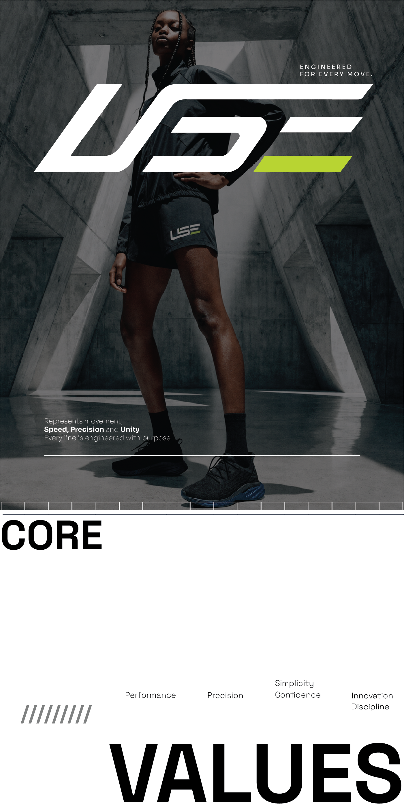
"Every line is engineered with purpose. USE represents movement, speed, precision, and unity — and the brand system had to embody that from the logo to the last pixel of the app interface."
Project Overview
Client Challenge
Building a brand system that could scale across physical products, digital platforms, and educational technology.
Fragmented Brand Presence
USETHIS Sportswear had inconsistent branding across social media, product packaging, and their early app prototype. No unified design system existed, resulting in a disjointed customer experience across touchpoints.
Digital-Physical Bridge
The brand needed to translate the tactile, physical qualities of athletic wear — texture, movement, precision — into a digital design language that worked across mobile app UI, social media graphics, and video content.
Cross-Platform Consistency
The branding system had to work seamlessly across the EduApp mobile interface (React Native), Instagram and TikTok social templates, YouTube promotional videos, and print materials — all while maintaining visual coherence.
Scalable Design System
The client needed a design system that internal teams could use to create new marketing assets without designer intervention, requiring documented guidelines, component libraries, and template systems.
Solution Architecture
End-to-end branding process from strategy to final deliverables.
01. Brand Strategy & Discovery
Conducted stakeholder interviews and competitive analysis across the athletic wear market. Defined four core brand pillars: Performance (engineered for action), Precision (stitched with purpose), Simplicity (confidence in silhouettes), and Innovation (disciplined craft). These pillars guided every design decision from logo geometry to social media tone.
02. Logo Design & Visual Identity
Designed a geometric logo system built on clean lines and structural dynamics. The wordmark USE uses a custom-modified typeface with engineered letterforms that convey speed and precision. The logo works in three configurations: full wordmark, monogram (U.), and icon — each optimized for different contexts from app icons to billboard displays.
03. Social Media Design System
Created a comprehensive social media template library for Instagram (feed posts, stories, reels covers), TikTok (video overlays, profile elements), and Twitter/X (header banners, post templates). Templates use a modular grid system with predefined type scales, color tokens, and component variations — enabling the marketing team to produce on-brand content in minutes.
04. Promotional Video Production
Produced a 90-second brand anthem video and six 15-second social media cutdowns. The video content combined product cinematography with motion graphics that extended the logo's geometric language into time-based media. Color grading used a high-contrast monochrome palette with selective accent moments, matching the brand's premium positioning.
05. Mobile App UI Branding
Extended the brand system into the EduApp React Native interface. Custom typography scales, iconography, and color tokens were implemented as a design system in Figma, then translated into React Native style objects. The app's visual language — from onboarding screens to the course dashboard — carries the same engineered precision as the physical product line.
06. Brand Guidelines Documentation
Delivered a 40-page brand guidelines document covering logo usage, color specifications (with hex, RGB, CMYK, and Pantone values), typography hierarchy, photography direction, social media templates, and UI component specifications. The guidelines ensured internal teams could maintain brand consistency across all future touchpoints.
Technical Implementation
Design systems, tools, and cross-functional alignment.
Figma Design System
Built a comprehensive Figma component library with auto-layout, variants, and design tokens. 120+ components covering social media templates, app UI elements, and marketing collateral. Tokens exported via Figma Tokens plugin for direct integration with the React Native codebase.
Logo Engineering
Logo constructed on a geometric grid with 8px base unit. SVG-based for infinite scalability across app icons (29px) to billboards (10m+). Three configurations (wordmark, monogram, icon) with documented clear-space, minimum-size, and color-variant rules. Animated logo reveal for video content using After Effects.
Social Media Template Architecture
1080x1080 (Instagram feed), 1080x1920 (Stories/Reels), 1080x1350 (portrait), and 1500x500 (Twitter header) templates. Each template uses a modular content block system — headline, product image, CTA, brand mark — that can be swapped without breaking layout. 24 template variants delivered.
Video Production Pipeline
Shot on RED Komodo 6K with cinema-grade anamorphic lenses. Post-production in DaVinci Resolve for color grading and After Effects for motion graphics. Delivered in 4K, 1080p, and vertical 9:16 formats for cross-platform distribution. Six social cutdowns edited from the master brand anthem.
App UI Brand Integration
Brand tokens (colors, typography, spacing) implemented as a TypeScript theme object in the EduApp React Native codebase. Custom font loading via Expo's font system. Icon set designed in Figma, exported as SVG, and integrated via react-native-svg. Brand-compliant component library ensured every screen matched the visual identity.
Cross-Functional Alignment
Weekly design reviews between branding team and EduApp engineering team ensured consistent application of the brand system. Shared Figma library served as the single source of truth. Brand tokens were versioned in a shared package, enabling both the marketing site (SvelteKit) and mobile app (React Native) to reference identical design values.
Brand Color Palette
High-contrast monochrome system with strategic accent moments.
Combined impressions across Instagram, TikTok, and Twitter/X within first 60 days of brand launch campaign.
Increase in branded search volume for USETHIS Sportswear in the 3 months post-launch.
Internal marketing team adoption of the social media template system — zero off-brand posts since launch.
Faster social media asset production using the template system vs. custom design per post.
Increase in app store download conversion after branded app icon and screenshots were implemented.
Total views across brand anthem and social cutdowns in first 90 days.
Logo system: custom-engineered typeface on geometric grid
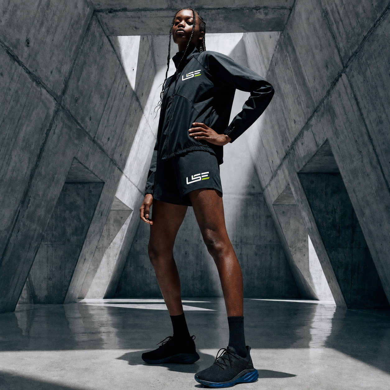
Brand hero imagery used across web, social, and app onboarding
Product portfolio showcase with brand-consistent photography direction